Retooling Staples: The $14B Global Engine
Role: Head of Worldwide Product Design - Global Sr. Director
Team Size: 35+ Designers & Researchers (Scaled from 5)
The Challenge: Managing a massive eCommerce sprawl across 16 languages and 9 global locations. Conversion was bleeding out through legacy tech and "click-heavy" flows.
The Solution: I led a total UX modernization, instituting a "Two-Click Access" rule and a unified cross-platform UI. We moved away from fragmented silos to a cohesive, customer-centric content hierarchy that prioritized intent over noise.
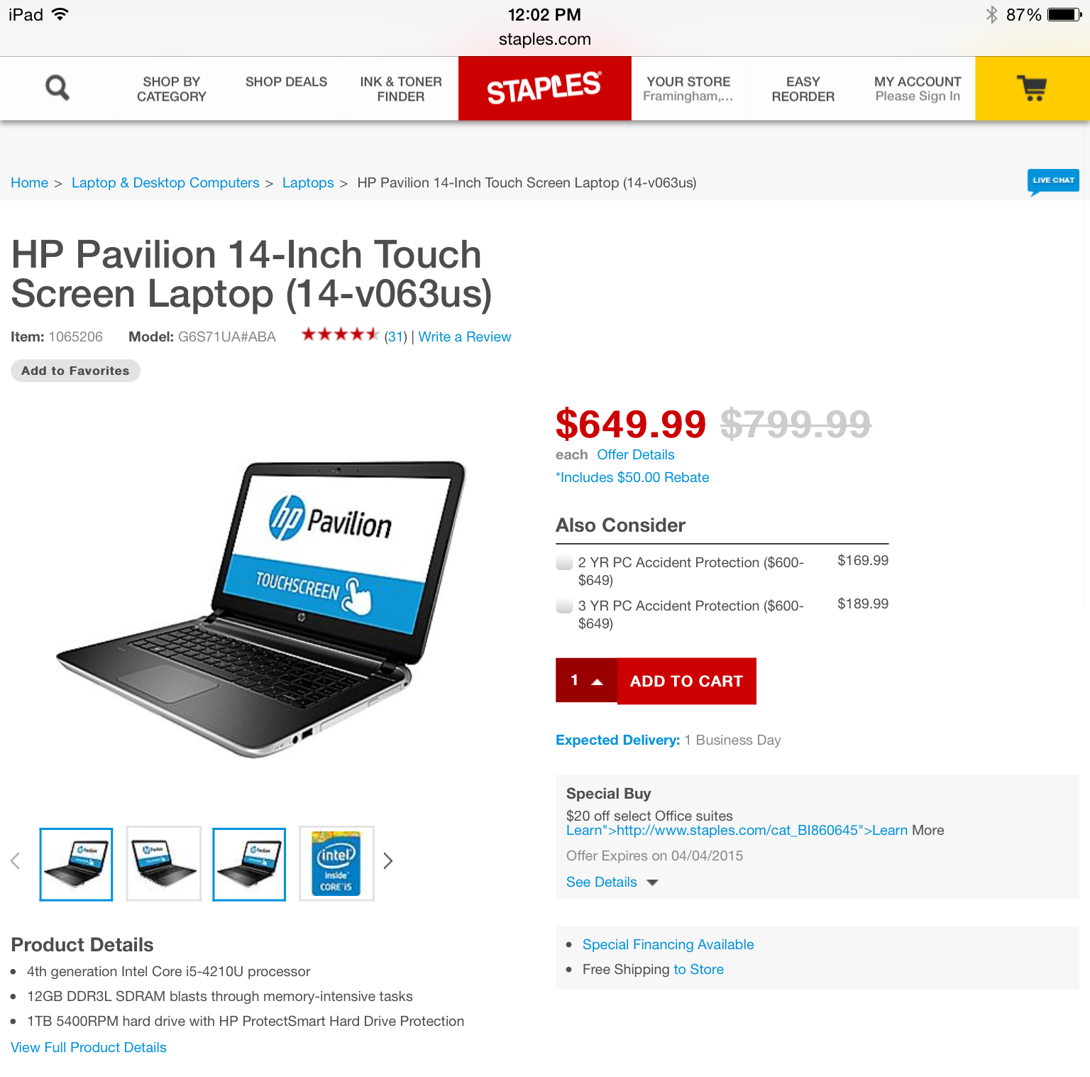
The Impact: Rebranded and retooled 20 mobile apps and 30 web products. We didn't just move pixels; we optimized a engine generating $14B in annual revenue.
🎯 Overall Goal of UXRefresh Initiative
The presentation lays out a long‑term UX strategy to unify Staples.com into a consistent, scalable, omnichannel ecommerce experience. The focus is on aligning every customer touchpoint with a clear UX vision to increase commercial yield, reduce friction, and modernize the digital ecosystem.
👥 Customer Insights That Drive Ecommerce UX Decisions
1. Multi‑Segment Customer Base
Staples serves a wide range of shoppers—students, parents, casual consumers, SMB owners, office managers—and they often overlap in behavior and needs. For ecommerce UX, this means designing flexible, adaptive flows that support both quick‑buy consumers and high‑intent business purchasers.
2. Clear Online vs. In‑Store Behavior Patterns
Customers shop in‑store for:
Complex products
Immediate needs
Returns
They shop online for:
Repeat purchases
Heavy/bulk items
Price comparison
Time‑saving convenience
This reinforces the need for:
Strong replenishment UX
Smart recommendations
Clear pricing
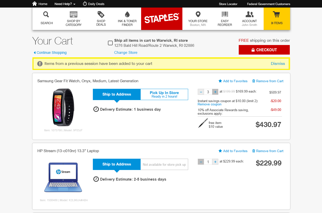
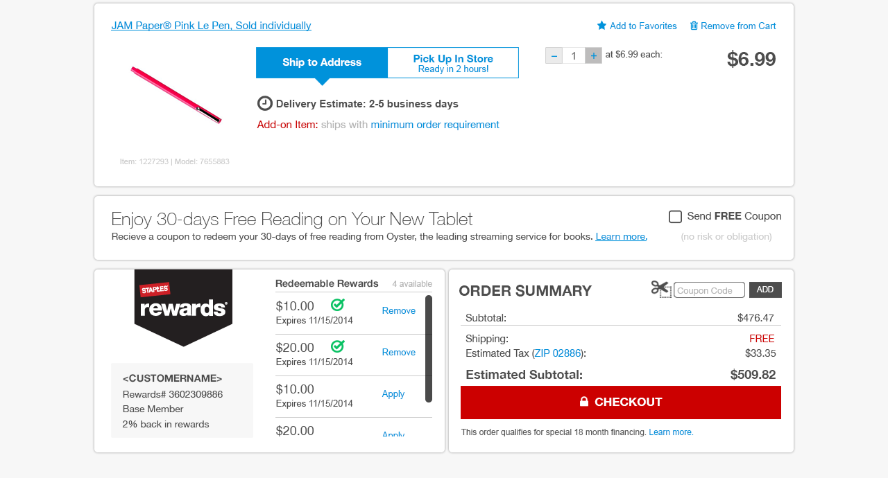
Fast, low‑friction checkout
3. Key Pain Points Identified
Homepage lacks personalization
Search is inaccurate and requires heavy filtering
Price breakdown (“math story”) is confusing
Ink & toner results are unreliable
Vertical buyers can’t find relevant products
Content quality is inconsistent
Page load times are slow
Live chat pop‑ups are intrusive
These are classic ecommerce conversion blockers—fixing them directly impacts revenue.
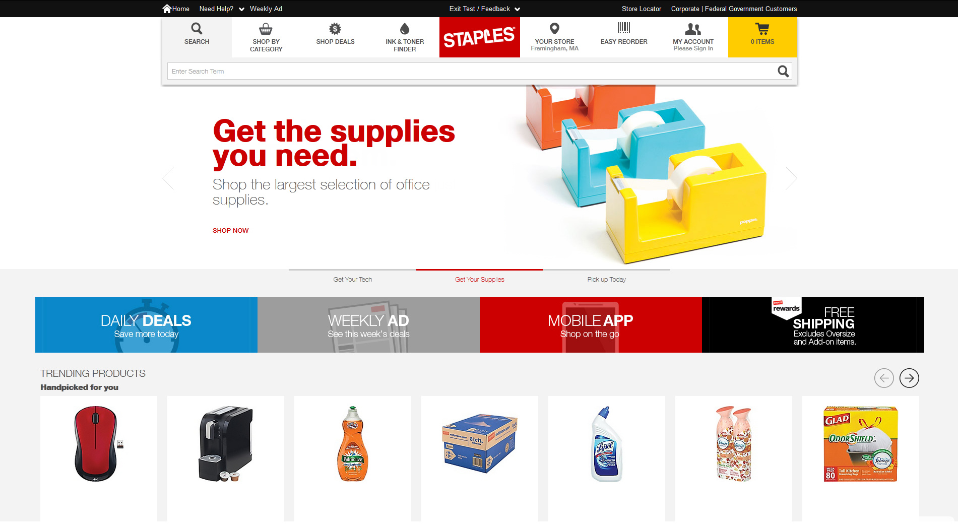
🧭 UX Vision for Staples.com
The target experience is defined as: Simple, fast, accurate, engaging, and delightful.
To achieve this, the UX team proposes:
1. Unified Cross‑Platform UI
A single UX across desktop, tablet, and mobile where possible.
2. Two‑Click Access to Content
A strict rule that product and content pages should be no more than two clicks deep.
3. Customer‑Centric Content Hierarchy
A four‑level prioritization model:
What the user explicitly needs
What they might also want
General inventory
Brand messaging & benefits
This is a strong ecommerce pattern that balances personalization with merchandising.
Ecommerce
🧩 UX Principles for Ecommerce Optimization
Behavior Optimization
Prioritize information progressively
Improve relevance in search and recommendations
Remove friction (e.g., confusing pricing)
Focus on core shopping tasks
Visual Consistency & Simplification
Audit and standardize fonts, icons, colors, buttons, imagery
Create consistent vendor templates
Use imagery strategically based on product type (lifestyle → detailed → simple)
This is foundational for a scalable design system.
🛠️ Ecommerce Roadmap Priorities
The next 12 months focus on high‑impact conversion areas:
Homepage redesign
SKU/product page redesign
Deals Central
Category & department templates
Cart & checkout refresh
Post‑transaction experience
Account management
Standardized marketing landing pages
This roadmap aligns perfectly with e-commerce best practices: fix the funnel from discovery → product detail → cart → checkout → post‑purchase.
📈 Gaps Between Vision & Reality
The deck highlights several blockers:
No personalization
Slow site performance
Inconsistent content governance
Too many clicks to purchase
No social/sharing strategy
Confusing pricing
Third‑party hosted features breaking UX (rebates, VistaPrint)
These gaps directly impact conversion rate, AOV, and customer trust.
🧠 What This Means for an Ecommerce UX Designer
From a UX perspective, this deck signals a major transformation effort requiring:
A unified design system
A search and navigation overhaul
A personalization strategy
A content governance model
A performance‑optimized UI
A clean, consistent visual language
A data‑driven approach to prioritizing personas and KPIs
It’s a shift from fragmented, business‑unit‑driven design to a centralized, customer‑first ecommerce experience.