Mozy to Carbonite
Simplicify Studio project: Mozy to Carbonite — A confidential Carbonite project to migrate Mozy customers after Carbonite bought Mozy. The aim was a clear, easy move to Carbonite products on 12–36 month plans without losing customers to free or cheaper alternatives. Outcome: very successful — over 80% of Mozy customers moved to Carbonite, often for multiple years.

Mozy to Carbonite: M&A Brand Integration
Role: Senior Product Designer
Location: Boston, MA
Team Size: 5 Designers / 2 Product Managers
The Challenge: Migrating millions of users from Mozy to Carbonite without causing mass churn or data anxiety.
The Solution: I led the strategic UX migration. I focused on the psychology of the "transition," ensuring the user's "peace of mind" remained intact while we moved their most precious data to a new brand home.
The Impact: Zero-friction migration with high retention rates, demonstrating that UX is the ultimate tool for successful M&A integrations.
🧭 Project Context
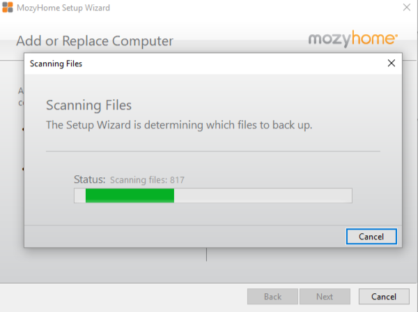
The deck outlines the Discovery-to-Definition phase for migrating Mozy users into the Carbonite ecosystem. The primary UX challenge is designing a friction‑free upgrade experience for Home and Small Office users, with a 3–6 month scope focused on UI conversion, brand migration, and improved usability.
The target personas include:
Single‑computer home users
SuperUsers / small offices (2–10 users, up to ~20 machines)
The design mandate emphasizes:
Error‑proofing
Responsive, modular UI components
Clear, helpful visuals
Designing for the “AOL user” — meaning low‑tech‑comfort, high‑clarity UX
🔍 Key UX Constraints & Opportunities
Limited Upgrade Touchpoints
Users can only upgrade through three channels, each with UX tradeoffs:
PathUX Strengths: UX Risks Email Personalized, can embed custom upgrade keys. Passive, easy to miss, mobile‑unfriendly Mozy.com Centralized, user‑initiated. Requires laptop + email; current banner implementation is weak. In-App Alerts: High‑context, catches users while using the product. Current implementation is limited; unclear if custom keys can be triggered
This creates a design requirement for consistent, guided flows regardless of entry point.
🧩 Design Principles Emerging from Discovery
The deck highlights several UX imperatives shaping the solution:
Componentize the experience so it scales from Home (simple) to Pro (powerful).
Communicate visually to reduce cognitive load.
Provide multiple paths but maintain a unified mental model.
Reinforce value themes: Upgrade, Security, Insurance for your data.
This suggests a modular design system with progressive disclosure and strong visual hierarchy.
🛠️ Proposed UX Patterns & Flows
Sticky Footer Interaction Pattern
A persistent footer is introduced as a key UX element across upgrade screens:
Houses the Upgrade Now CTA
Requires explicit acceptance of Terms & Conditions
CTA remains disabled until acceptance
Turns green when actionable
This pattern ensures:
High visibility of the primary action
Clear compliance gating
Consistent placement across steps
🚶♂️ Happy Path Walkthrough
The deck outlines a clean, linear upgrade flow with minimal user effort:
1. Review / Choose Plan
Triggered from email or site.
Defaults pre‑selected (e.g., Plus plan, single machine, unlimited storage)
Device data pulled from Mozy, shown as static info
Mobile screens use step‑forward controls for accessibility
2. Choose Devices
Simple UI for reviewing or changing machines
Mozy device data shown; laptop info is non‑editable in this flow
Edits trigger a dedicated edit path
3. Payment Method
Carbonite discount applied
“Free time” between Mozy and Carbonite billing is shown
Mozy credit card info pre‑populated for convenience
4. Upgrade Complete
Confirmation screen with plan details
Download instructions and links to all installers
Reinforces successful transition and next steps
🧠 UX Takeaways
From a UX product design perspective, the deck reveals a project focused on:
Reducing friction in a multi‑step, multi‑entry upgrade process
Leveraging existing Mozy data to minimize user input
Creating a unified, branded Carbonite experience
Designing for clarity and confidence, especially for low‑tech users
Building scalable components that can later support Pro and Enterprise flows
The overall UX strategy is about meeting users where they are, simplifying decisions, and ensuring the upgrade feels safe, guided, and beneficial.